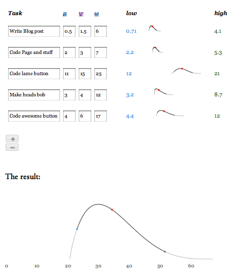
A couple of weeks ago I wrote about a simple yet powerful process for software estimation. When I was done I started to look at my excel worksheet for doing this process and figured that it could be something I could share with a broader audience. Rather than just post an excel file, I decided to create a simple software estimation app and post it here. You can go check it out now, or read on to get a bit more detail into the thinking behind it.
The application
The application is really simple. You just break down your project into a few tasks and enter three estimates for each—Optimistic, Nominal and Pessimistic (To get what I mean about these terms, check out this post). What it then does is calculate the expected duration of the tasks as well as a high and low end of a range that you can have 95% confidence in. On top of that, it consolidates all of your estimates into a rolled up view that tells you how long you can expect your full project to take. See, there can be some science behind software estimation after all (if you want the details behind how the estimates are worked out, they’re covered in a previous post).
The sparklines
One of the things I wanted to do over and above a spreadsheet was to make something that was clean and simple to read yet packed a lot of information into each row. What originally was six data points has been reduced to two thanks to using sparklines. I could have possibly also done away with the low and high end estimates and had them as rollovers (like in the main result chart) but I just found it to be too overloaded and hard to read. I’ve found that there has been some really nice outcomes from using the sparklines:
- I can see which tasks have the most uncertainty in them (those with the broadest range)
- I can see how different tasks stack up against one another by comparing the sparklines vertically (they’re all on the same x axis scale). I can do this much quicker than if it were a numeric table
- I can present a hierarchy of information. The ranges are most important, then the expected time (which you can see on rollover), followed by the variance and the shape of the estimate which you can infer from the shape of the chart
The results script
One of my big frustrations is that when people come up with software estimates, they give you values that imply a far greater precision than is reasonable. I’ve seen software estimates for a project in terms like “3042.5 hours” What this does is imply that the estimate is between 3042.45 and 3042.55 hours. Far more likely is that you have added up a number of estimates and at best you might be precise to within ten, twenty or even fifty hours (tough to say without knowing more about the estimate, but you get the drift). With the results script, I’ve tried to represent this by using natural language to lessen the implied precision. A few examples:
- Anything less than 1 is represented as “A few hours” “less than a day”
- Up to a week you have “A couple of days” or “A few days”
- Up to a month you have “About a week, a couple of weeks, three weeks
- More than that, time is measured in months
While looking into this, I also found this article talking about the psychology of the zero. In essence it says that people are more likely to ‘accept’ a number with implied precision than one without. If you want to try this out and use the calculated numbers, rolling over the dots on the results plot will give you them. I also left in the calculated numbers for the individual tasks so you can see what’s going in to the final estimate.
What’s next?
Well, I’m hoping you’ll tell me. Right now, all estimates are in days and part days, but I thought I could add an option so you could put estimates in hours for smaller tasks. Maybe some export options or something. If you use this app and get some value from it, let me know if there’s anything else you’d like to see it do. So go ahead and try it out and let me know what you think!
